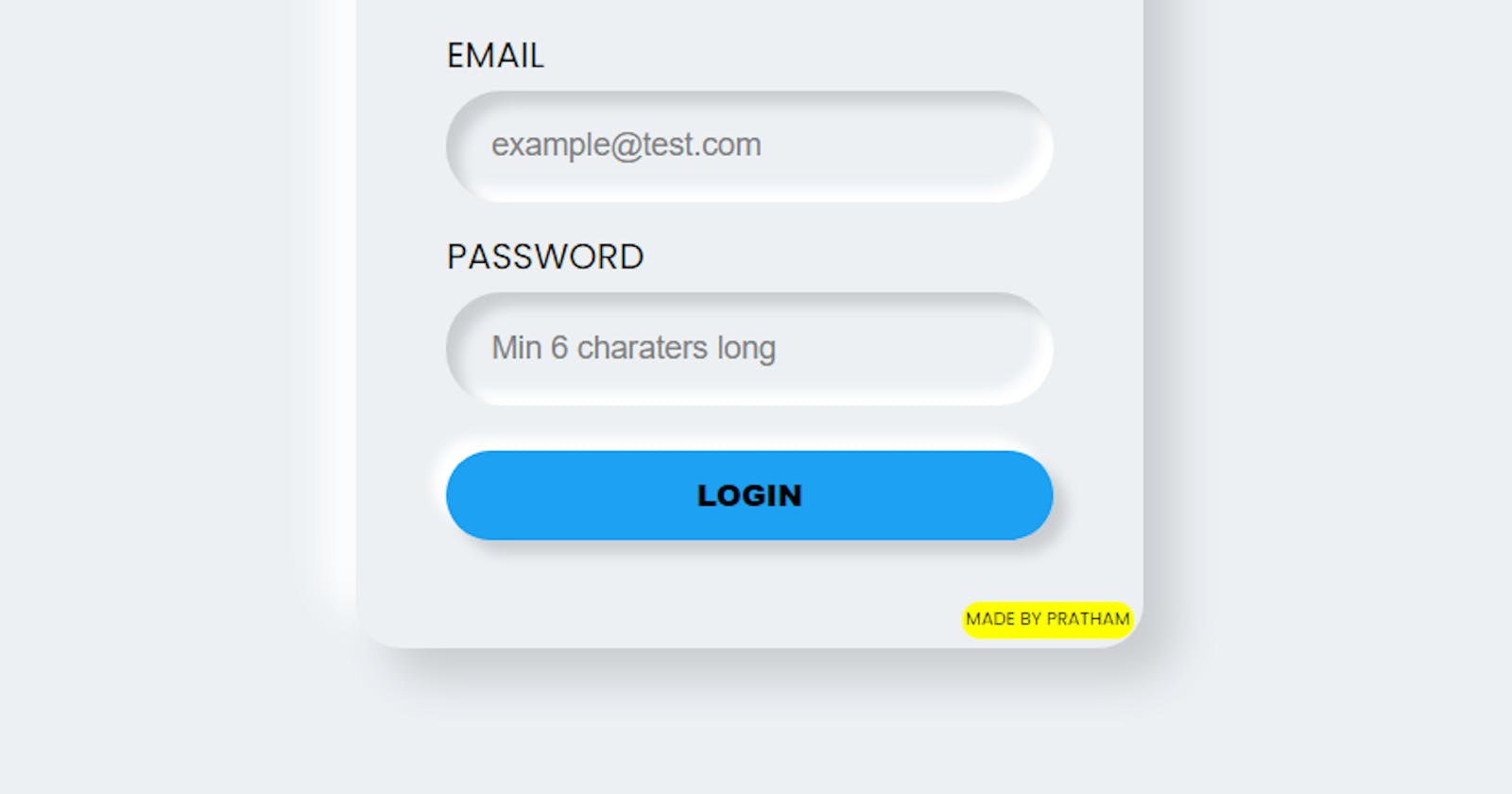
Neumorphism, which essentially crosses the words “new” and “skeuomorphism”. Essentially, it's a new, minimal way to design with a soft, extruded plastic look. It's almost as if the interface has been vacuum-formed.
Neumorphic design is all based on box-shadow property. You just need to remember two things👇
- Protrude effect in outer element (normal box-shadow)
- Sunken effect in inner elements (Inset box-shadow)
Enough explanation I guess, Let's understand this concept by creating a neumorphic form.
STEP 1:
Place a light source(virtually) on screen. In this example I'm considering that my light source is placed top left corner of the screen

STEP 2:
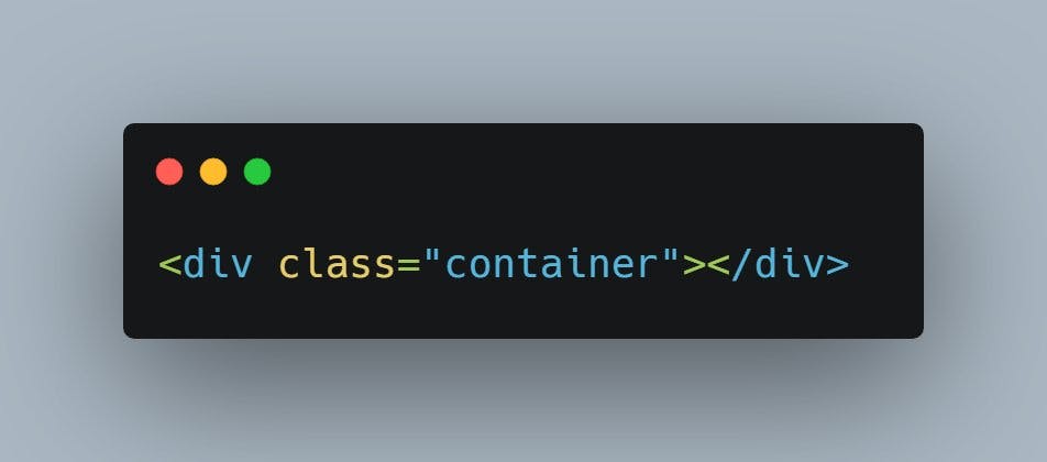
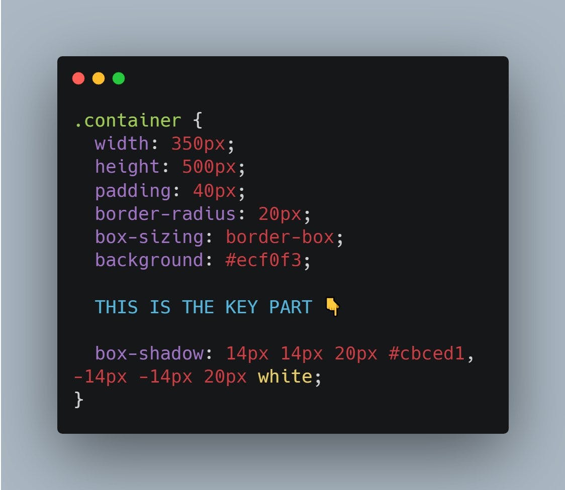
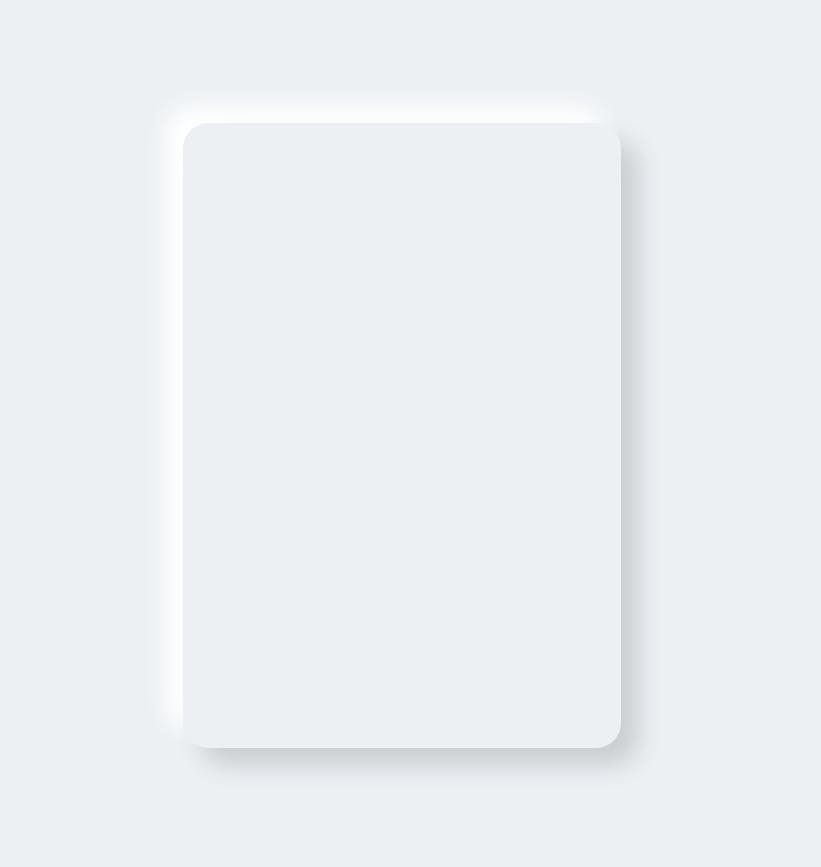
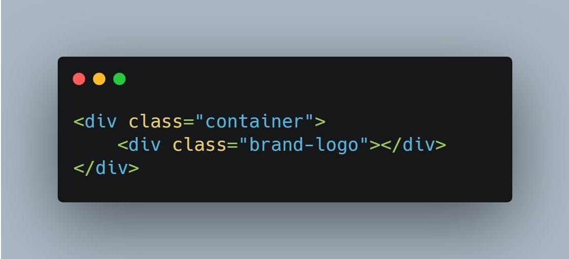
Create a container div and set background color slightly darker than white. I picked #ecf0f3 Make sure that the color of body and container should be same. As we placed our light source on top-left corner, make sure left and top border of container should be brighter than right and bottom border.
This will make the element looks like it has the light source illuminating from the top left corner of the screen.
STEP 3:
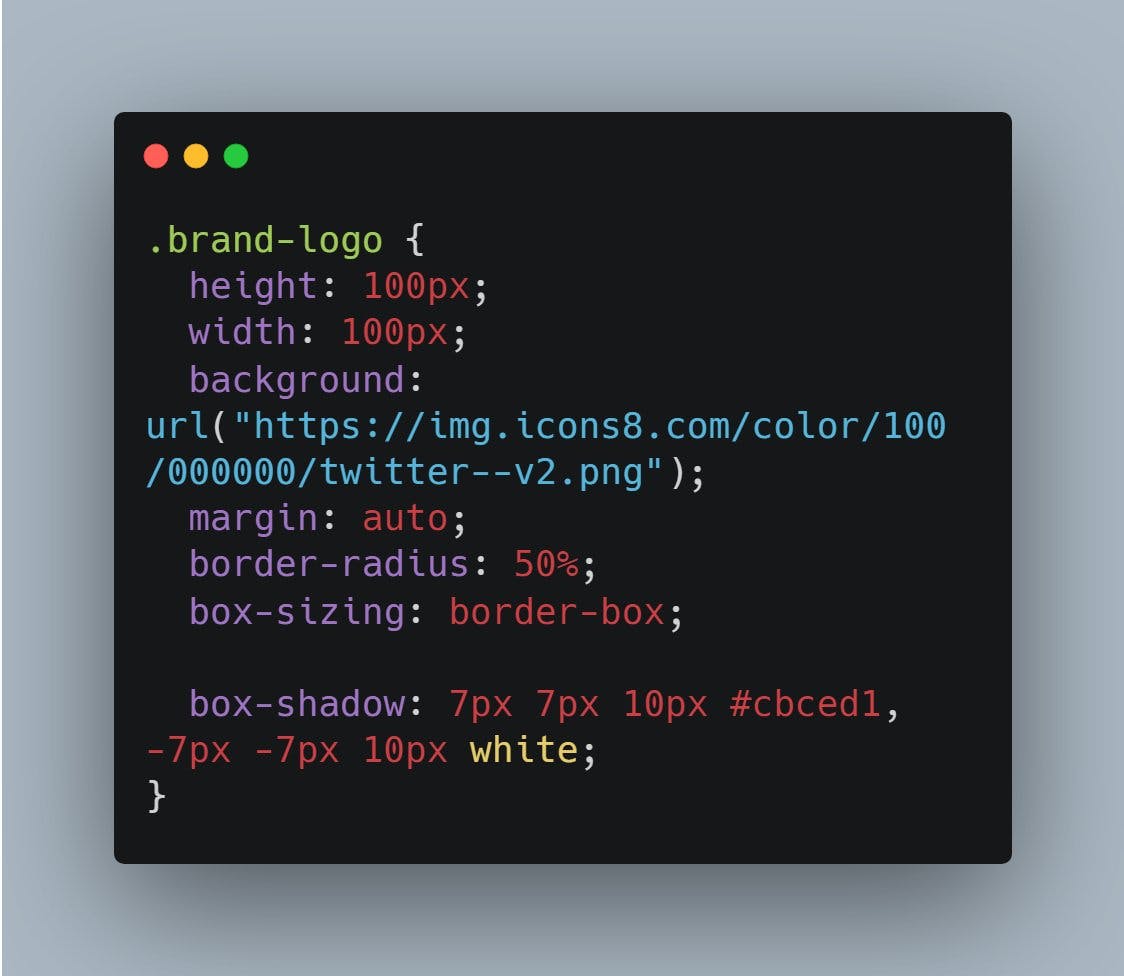
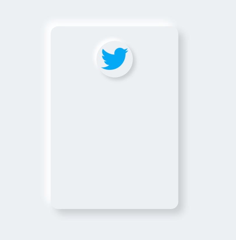
Create a brand logo using same technique. Since brand going to protrude from the container, use same color i.e, #ecf0f3
Add bright color shadow at the top left side and dark color shadow at the bottom right side
STEP 4:
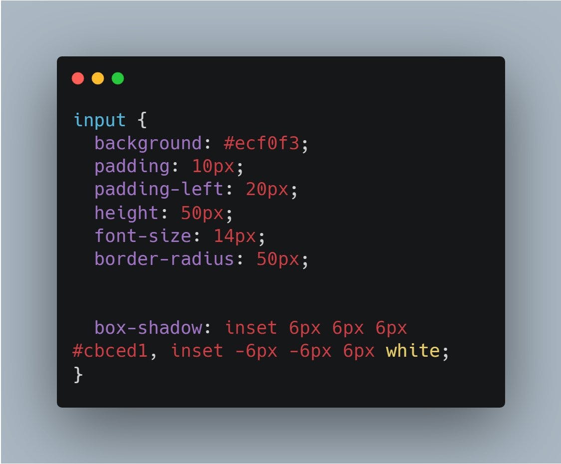
The input fields going to have a sunken effect. And to achieve this we will use inset box-shadow. As light is coming from top-left corner, hence right and bottom border will be bright in this case because input fields have sunken effect.
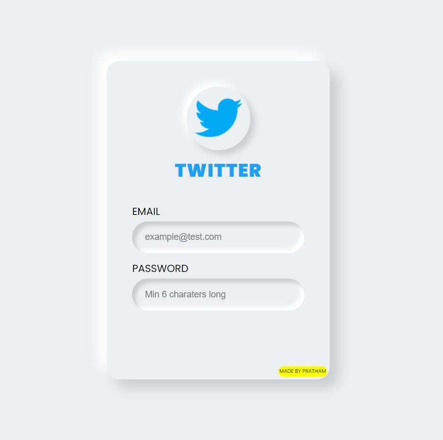
STEP 5:
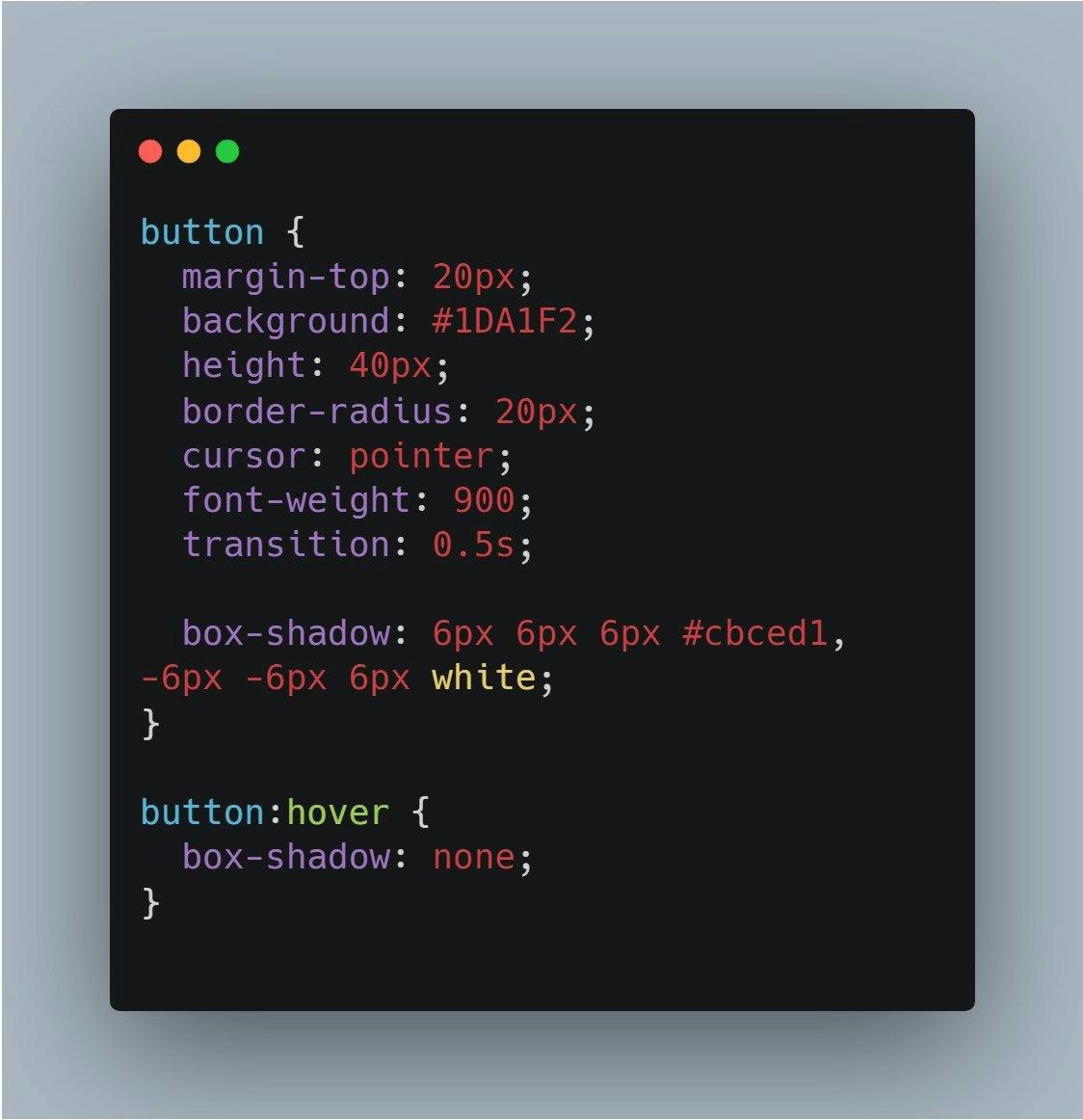
Create a button preferably of same color as logo because this will give you a more fascinating look to your design
Add hover selector and apply box-shadow none when you mouse over it
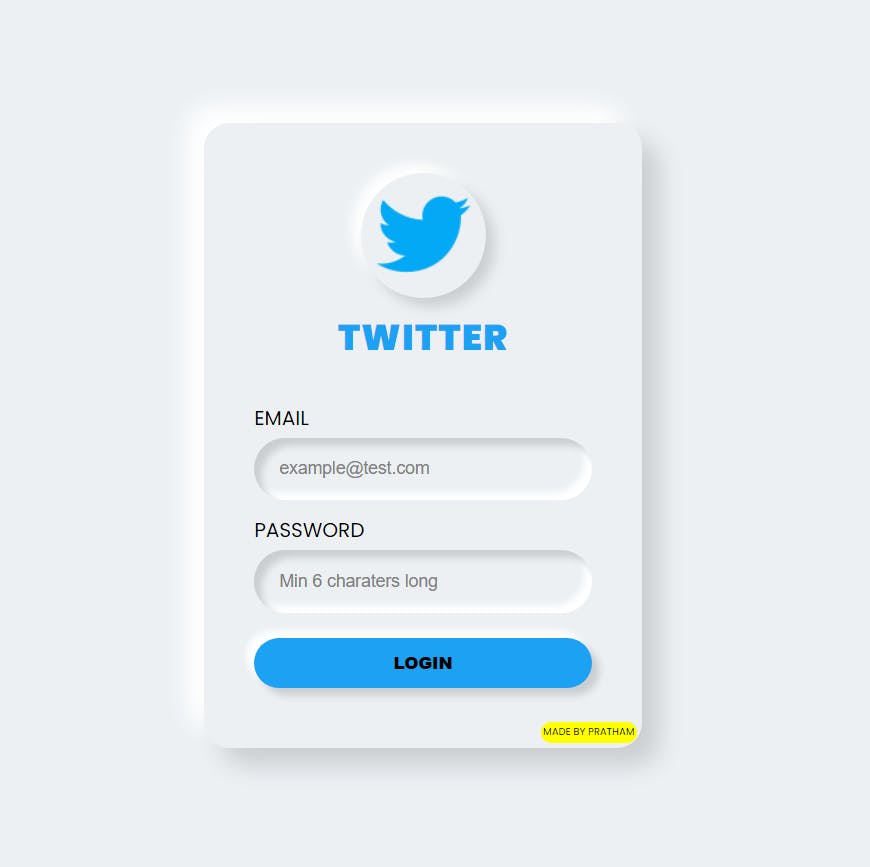
That's it😍 Congrats!! You have created your first neumorphic form in less than 15 minutes I guess.
SOURCE CODE => Codepen
Thanks for reading this 🙏❤
